Coverings Ambassador Alena Capra shares how she has used tile trends from 2017 in projects this year:
Over the last year, we have seen many tile trends emerge — Metallics, wood looks, industrial looks, black & white, blues, and 3D to name a few. As an interior designer, I love finding new tile to use in my designs for clients, which is why attending Coverings every year is so important to me! Using something new, and different in a design is always exciting. Below I’m going to show you how I’ve incorporated some of the top tile trends from the last year, into some of my designs.
Wood Look
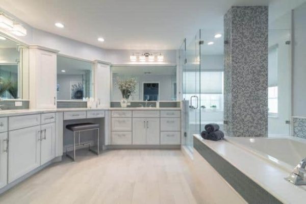
While I consider wood porcelain more of a staple in the industry at this point, I believe the colors, plank widths, and styles is what makes more of the trend in this category. This past year, we’ve seen wood porcelain in lots of grey hues, taupe’s, and soft whites. One of the most popular tones in this look that I’ve used is the soft grey. In two recent master bath projects, I used similar grey wood porcelain. One was set in a herringbone pattern, the other in a more traditional staggered wood set. The result for both? A calming, and beautiful retreat. The grey toned wood mixed well with the Carrera marble mosaic in one bath, and in the other white porcelain, and blue mosaic and brick. (I also incorporated a bit of the blue color trend we’ve seen there!) What I liked about these wood porcelain tiles most was not only the beautiful color, but each of the planks had a slightly different texture, and really had a very authentic feel.
Industrial Look
We’ve seen a lot of industrial style tiles emerge as well…. think concrete looks, and even some oxidized metals, a style that I’ve used different ways this last year in both residential and commercial projects. In particular, clients have loved the porcelain that resembled polished concrete, in hues of greys and charcoals. I recently used one in a workout studio (the Vixen Workout Studio, in Wynwood)— in the locker room areas, as well as on a prominent accent wall where we set it with a wider grout joint, to look like large cement blocks. I used a similar type of tile on the main flooring of the check-in/lobby area of a small boutique hotel in Miami, called Fortuna House. In both spaces, this chic, industrial look tile created the perfect look for the style that was to be achieved.
Black and White
Nothing is more classic than black and white decor! I absolutely love this look! Last year, I designed an entire home for a client in this theme, and we used everything form large format polished porcelain that resembled statuary marble on all of the floors, to beautiful black and white mosaic on the kitchen backsplash, and bold black and white countertops. We are calling it a trend, but you really can never go wrong with neutrals. I love the sophistication of an all black and white interior. This trend works well from more traditional spaces, to transitional and modern as well.
Metallics
Metallics have been trending heavily, and I think also are one of the trends with staying power. We have seen everything from gold’s to silvers, and copper to platinum. I think a little pop of metallic in a tile design is always adds a nice touch. Or even a bold accent wall. Whether it is a mosaic or a larger size tile, the hint of glam a metallic tile adds is always beautiful. I’ve even recently mixed the metallic with an industrial concrete tile, for a nice juxtaposition of edgy and glam. I’ve also incorporated it into a client’s master bath, as a fun pop of copper on the tub deck, backsplash, and shower wall. Since we have seen so many new faucet and fixture finishes emerge from manufacturers (rose gold, copper, matte gold, pewter, etc.) it’s a perfect compliment to any design to have a coordinating metallic tile!
Blues
How can we talk about tile trends and not mention blue? Blue is my favorite color to design with, in any space. I always say it’s a NEUTRAL, because most people like it in decor as an accent…it’s soothing, and calming. I also have designed for clients where blue is the predominant color in their entire homes. You can never go wrong with a little…or a lot of blue! In many of my recent bathroom designs, I’ve incorporated everything from soft grey blues, to bolder more turquoise shades.
New Tile Trends
I’ve really enjoyed incorporating so many of the beautiful tile trends we’ve seen over the last year into my designs but I am very excited to use some of the new ones too! I noted so many amazing new trends at Coverings this past April, lots of blush toned tile, terrazzo looks, and even some beautiful shades of green tile. I’ve already started to see some of them at my favorite tile showrooms, and can’t wait to use them in new designs.


